
With iOS 14, Apple began to open the floodgates for software customization on the iPhone. For the first time, you could add widgets to the home screen and even change app icons to custom ones without the need for a jailbreak. And iOS 16 gave us some more customization options in the form of the lock screen, although the interface for that is su-par, to say the least.
While I see a lot of people still use a stock grid layout on their home screen, I took some time when iOS 14 first came out to customize my iOS experience. I enjoy that it’s not just a boring grid of stock icons — having custom icons and widgets really mix things up a bit and gives me a more informative home screen.
Here are a few tips on how I created my perfect iPhone home screen, and how you can do so too.
Adding some Depth to my home screen icons
When iOS 14 first launched and people began the “aesthetic AF” home screen trend on TikTok, it blew up in a way that I never thought was possible. People were theming their home screens with unified icon sets and widgets — and I had to join the train too.
But after seeing all of the steps needed to make a single custom app icon in Siri Shortcuts (it was around 20 steps for each icon), I knew this was going to be something I only do very rarely because it’s so tedious. Two years later, it’s as cumbersome as ever — I seriously don’t understand why Apple won’t just streamline the process, or maybe just open up a custom theme store of some sort? It would literally print money for the company.
So with that in mind, I decided to hold off on changing out all of my main home screen icons until I found a good icon theme pack that I like enough to warrant an hour just to get everything set up. I forget the exact way I stumbled upon Polyphian’s Depths icon theme, but I think it was from browsing the iOSsetups subreddit.
But why Depths? Ever since iOS 7, app icons have become flat and boring, losing much of the unique charm and character that made them special before. And a lot of icons these days also look very similar to each other, which I’m also not a particular fan of.
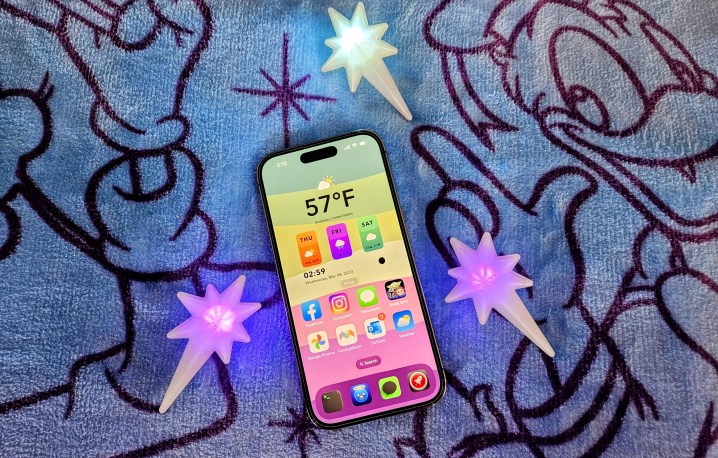
Depths retains most of what you see in the stock icons but adds much-needed, well, depth to them, which makes them stand out. Polyphian also has variant colored versions of the icons, all of which support both light and dark themes (I’m a dark mode person myself). For me, Depths is like the original icons but done much better. On my iPhone 14 Pro, since I have dark mode turned on 24/7, I have the majority of my custom Depths icons set to the dark background, allowing the colored icons and logos to pop, with the exception of a few where I prefer the colored background.
I’m the kind of person who usually sets up one thing and sticks with it for a good, long while. For example, prior to iOS customization without a jailbreak, the apps on my home screen remained unchanged for several years, and the apps would be critical pieces of software that I depend on daily for them to earn a spot on my home screen and dock. The same can be said for my custom app icons; I’ve been using Depths on my home screen for around two years now.
Perhaps it also has something to do with Apple’s cumbersome process with Siri Shortcuts that I just can’t be bothered to change up my entire icon theme again, but I also just really like Polyphian’s Depths, though it’s far from the only themed icon pack (or wallpaper) he’s done.
Information at a glance with widgets

Another big change Apple made in iOS 14 was the ability to finally add widgets to the home screen, versus only having them in the Today view (a poorly named view you only see when swiping to the right of the home or lock screens). I was excited when this became a thing, as I liked breaking up the monotony of just 1×1 app icons on a grid.
At the moment, I have a two-page setup for my home screen. The first contains my custom app icons, but the layout is broken up with a medium size widget stack at the top, and then a small widget stack underneath, before it goes into my standard app icons.
I chose to stack multiple widgets on top of one another so I can swipe through numerous bits of information throughout the day. My top medium widget stack contains useful glances for my calendar (Fantastical), batteries, family memories through my Family Album app, Mastodon timeline, and more. I enabled Smart Rotate and widget suggestions too, and still get surprised by how useful it’s been. I usually get some helpful widgets relating to work or just my downtime, as machine learning on my iPhone 14 Pro has adapted to my usual day-to-day schedule.
On the other hand, my smaller widget simply shows my Apple Watch Activity Rings data, giving me an idea of how active I’ve been throughout the day. Seeing this motivates me to get up and move when I need to. I also like to use this small space to stack other health-related widgets, allowing me to swipe through with ease.
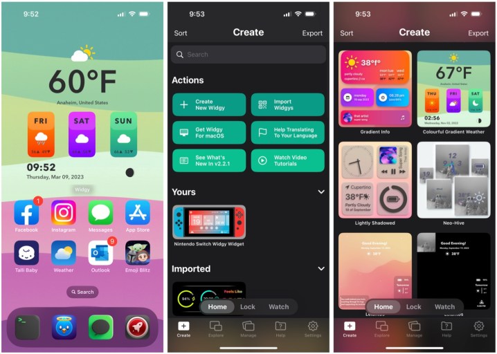
My second home screen page is just two medium-size widgets, which take up the entire page. The first half is dedicated to the Widgy app, which lets you create cool, custom widgets that can display all sorts of information or whatever cool thing you want. It’s highly customizable, but can be a little technical — I simply look for cool Widgy widgets on the iOSsetups Reddit and save them, as a lot of people use this app in particular. My current Widgy shows the temperature for my location in large text, as well as the upcoming weather for the next three days. It also shows the time and date, though due to iOS limitations, these aren’t in real time.

Finally, the second widget I have is just a Siri Suggestions widget for apps. It did take a few days for the machine learning to kick in, but it seems to give me reliable app suggestions, depending on the time of day, whenever I flick to my second page. I’m pretty much a creature of habit, so the Siri Suggestions widget almost feels like my phone reading my mind, because the app I want pretty much always shows up when I need it to.
My current default lock screen has no widgets since it interferes with the depth effect of my wallpaper. However, I do have one set up with two small 1×1 widgets for weather and my calendar. Having this information available on the lock screen is useful, as all I need to do is take a quick look at my phone without even needing to unlock it.
Topping it all off with a fun wallpaper
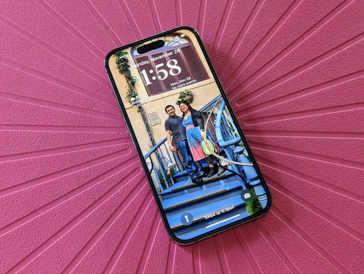
Wallpapers will always be a subjective thing — there is no one best wallpaper that is suitable for everyone. I personally like having some fun, colored backgrounds on my home screen, and I’ve switched to using personal photos as my lock screen wallpaper. This was incredibly helpful when I almost lost my phone in a Disneyland restroom, and someone was able to return it to me because I ran back inside a few minutes later and someone recognized me because my phone’s wallpaper had a photo of my husband and me.
But sometimes, I do like to switch it up. If I’m not using a photo I took myself, then it will probably be a wallpaper relating to something else I love, such as Disney-related imagery, or something with my favorite franchises, video games, or whatever. Maybe even something that just looks cute. Prior to iOS 16 ruining the interface for changing up wallpapers, I would change my wallpaper as often as I change my phone case (very often).
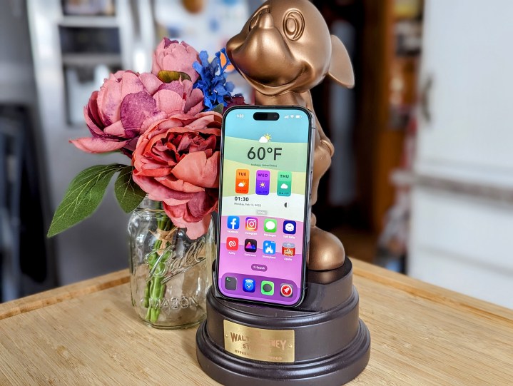
As far as the home screen wallpaper, though, while I prefer fun, colored backgrounds with my favorite hues (pinks, greens, purples, etc.), I don’t like them being distracting either. That’s why my home screen wallpaper usually ends up being some kind of abstract image or something with a simple design or pattern, maybe even a simple photo (blades of grass, for example) if I’m up for it. But I’ll never use something like a family photo as my home screen wallpaper, because they’re usually too busy and end up getting blocked by icons and widgets anyways, so what’s the point?
I tend to find wallpaper images all over the internet. But some of my favorite places to find new and interesting images are on the r/Amoledbackgrounds subreddit, as well as the Wallaroo app from The Iconfactory. My current home screen wallpaper is one I made with the Pastel app.
The perfect iPhone home screen is up to you

My iPhone home screen has mostly remained the same for years, but the customization options that Apple gave us in iOS 14 let me freshen it up a bit without having to jailbreak. Then iOS 16 let us change up the lock screen with some new typefaces, colors, and widgets.
I just talked about how I made the home and lock screen on my iPhone 14 Pro work for me, but again, this is all subjective. You can also customize your home screen with app icons and widgets, but honestly, if you’re a newcomer, it can be very daunting and overwhelming. I find the r/iOSsetups Reddit to be a fantastic starting point if you want some ideas and inspiration, as some of the users there have some very creative and fun setups. Most users also share where they got their themed icon packs, wallpapers, and widgets from too, though be warned — not everything is going to be free to access.
As far as widgets, I would think about the kind of information you would find useful to see at a glance throughout the day. Whether it’s on your lock screen or home screen, widgets let you just see what matters most to you in a quick way. I do wish Apple would add some interactivity to widgets because they’re pretty much glorified app icons still, but that’s a story for another day.
It took some time for me to get my perfect iPhone home screen, but it was well worth it. It all just comes down to what you want to get from your own.
Editors' Recommendations
- The one thing the iPhone 14, Galaxy S23, and Pixel 7 all get wrong
- Watch the Galaxy S23 Ultra and iPhone 14 Pro Max face off in brutal drop test
- I tried replacing my $4,000 camera with the Galaxy S23 Ultra and iPhone 14 Pro
- A new Android 14 update is here — but you still shouldn’t download it
- Your Google One plan just got 2 big security updates to keep you safe online


